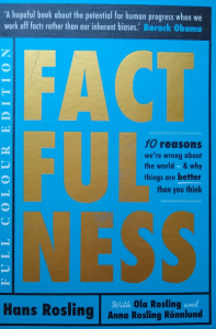
We could all do with a bit of ‘FACTFULNESS’

Every day we seem to be bombarded with statistics of one sort or another in connection with the Covid-19 crisis. The phrase ‘the scientific evidence leads us…’ is one that is frequently heard. If you ever needed any persuading about the importance of having a modest statistical education, then our current predicament should be motivation enough. Well, it is either that or just ignore all the ‘experts’ altogether and read the tea leaves (and they are not as common as they used to be).
We might not know the precise definition of GDP but we know that the countries with the smallest GDP are the poorest in the world. We might not know the precise UK Government definition for someone in the UK living in poverty – but we do need to know that there are nearly 4 million children in the UK that come under this Government definition – and that is something about which we should be taking action.
However, there is a great tendency to try to simplify things. So, in a global context, we speak of the ‘countries of the North’ and the countries of the ‘global South’, ‘developing’ countries and ‘developed’ countries, ‘rich’ and ‘poor’ nations. What this does is create pictures in our heads about what it means to live in a ‘rich’ or a ‘poor’ nation.
The trouble is, it simplifies our pictures to the extent that they distort our understanding.
 This is one of the issues explored by Hans Rosling in his book ‘Factfulness’. It is a book that I thoroughly recommend to everyone. There is no getting away from it: this is a book about statistics! It is about all the sorts of statistics that anyone interested in understanding poverty and inequality needs to know about. It is the only book on statistics that I have ever come across that is a real ‘page turner’!
Rosling’s interest is in getting people to get beyond the Rich/Poor dichotomy. So, instead of splitting countries and individuals into two categories he splits them into 4 categories by income. That’s not difficult to understand is it? However, merely by doing this he transforms the way in which we can view the world. It helps us understand the world in a much more practical way – and it has real implications in terms of the policy measures that should be taken to improve the lives of the world’s poorest.
Whilst the book contains lots of bubble charts and other graphs, it is his storytelling style that takes you along with him in his exploration of the world. He was (he died of pancreatic cancer in 2017) a doctor who spent time working in Mozambique and became a professor of International Health at the Karolinska Institute in Stockholm. The humility of his self-deprecating stories and his total commitment to helping people understand the world better shine through in his narrative style.
The book itself starts off with a quiz. You can take the quiz online, see the link below. I cannot recommend this enough – you might be surprised at the results. I hope it encourages you to read the book: you will not be disappointed.
If you take the quiz then also take a look at dollarstreet – it’s part of the same website. It is a great resource for discussions about how people live in other parts of the world and what different levels of income mean in different countries.
*****************************************
